
Male Modeling Headshots: Best Practices for Confidence and Style
Male modeling headshots are essential for anyone aspiring to build a successful career in the modeling industry. These images serve as your first impression, showcasing your unique look, personality, and versatility. Whether you’re preparing your portfolio or applying for casting calls, your headshots can make or break your chances of standing out in a competitive market. Achieving the perfect...
Professional Business Headshots for Women: What to Wear and How to Pose
In the professional world, a high-quality business headshot can make a lasting impression. For women, it’s an essential tool for personal branding, whether it’s for LinkedIn, company websites, resumes, or any other professional platform. A great business headshot showcases your confidence, personality, and professionalism. But getting the perfect business headshot involves more than just...
20 Modern Corporate Group Photoshoot Ideas for Stunning Team Pictures
Corporate group photo shoots have become an essential part of building a company’s brand identity, boosting morale, and creating a unified and professional image for businesses. Whether you’re looking to update your company’s website, enhance your social media presence, or just document your team’s success, a corporate group photoshoot is a fantastic way to capture your team’s spirit and...
What to Wear and How to Prepare for Your Photoshoot for Acting
When preparing for a photoshoot for acting, every detail matters. Your photoshoot for acting is one of the most important tools in your career as an actor or actress. It’s a way for agents, casting directors, and other industry professionals to see your potential and the range you can offer. The photos you create during this session will speak volumes about you, which is why preparing and...
Top Corporate Photoshoot Ideas to Boost Your Brand Identity
In today’s competitive business world, a strong brand identity is crucial for success. One of the most powerful tools to elevate your brand’s presence is through visual content, particularly corporate photoshoots. A well-executed corporate photoshoot can reflect your company’s values, mission, and professionalism, helping you make a lasting impression on clients, customers, and employees....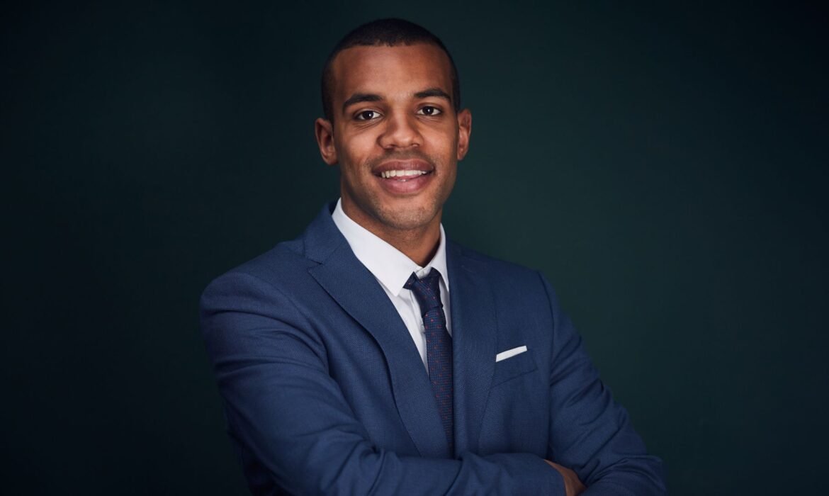
Commercial Headshots 101: Everything You Need to Know
In the modern business world, a commercial headshot is a powerful tool for creating a professional image. Whether you’re a business owner, a corporate executive, or someone looking to build your personal brand, a commercial headshot plays a key role in how others perceive you. In this comprehensive guide, we’ll explore everything you need to know about commercial headshots, from what they are...
Top 15 Creative Headshot Ideas to Showcase Your Unique Style
Headshots are often the first impression others have of you, whether they’re for your professional portfolio, social media profile, or personal brand. However, traditional headshots can sometimes feel too stiff or standard. If you want to stand out and convey a bit more of your unique personality, creative headshots are the way to go. These photos go beyond the basics and add an artistic flair...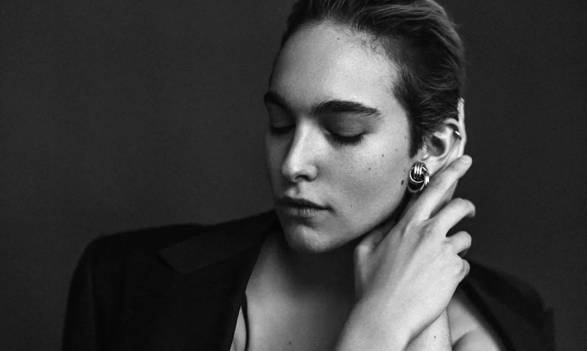
Mastering Black and White Headshots: A Guide to Timeless Portraits
Black and white headshots are a powerful way to capture the essence of a person in a timeless and elegant manner. While color photography may grab attention, black and white headshots have a unique ability to convey emotion, depth, and sophistication. These portraits have stood the test of time, remaining relevant in various fields such as business, acting, and personal branding. Whether you...
The Ultimate Guide to Actor Headshots: Tips, Poses, and More
Actor headshots are essential in an actor’s career. They are one of the first things casting directors see when considering someone for a role. A strong headshot can make all the difference between getting an audition or being passed over. But how do you take the perfect actor headshot? What do you need to keep in mind when posing? This ultimate guide will walk you through everything you need...